Back
Reducing uncertainty in wholesale buying.
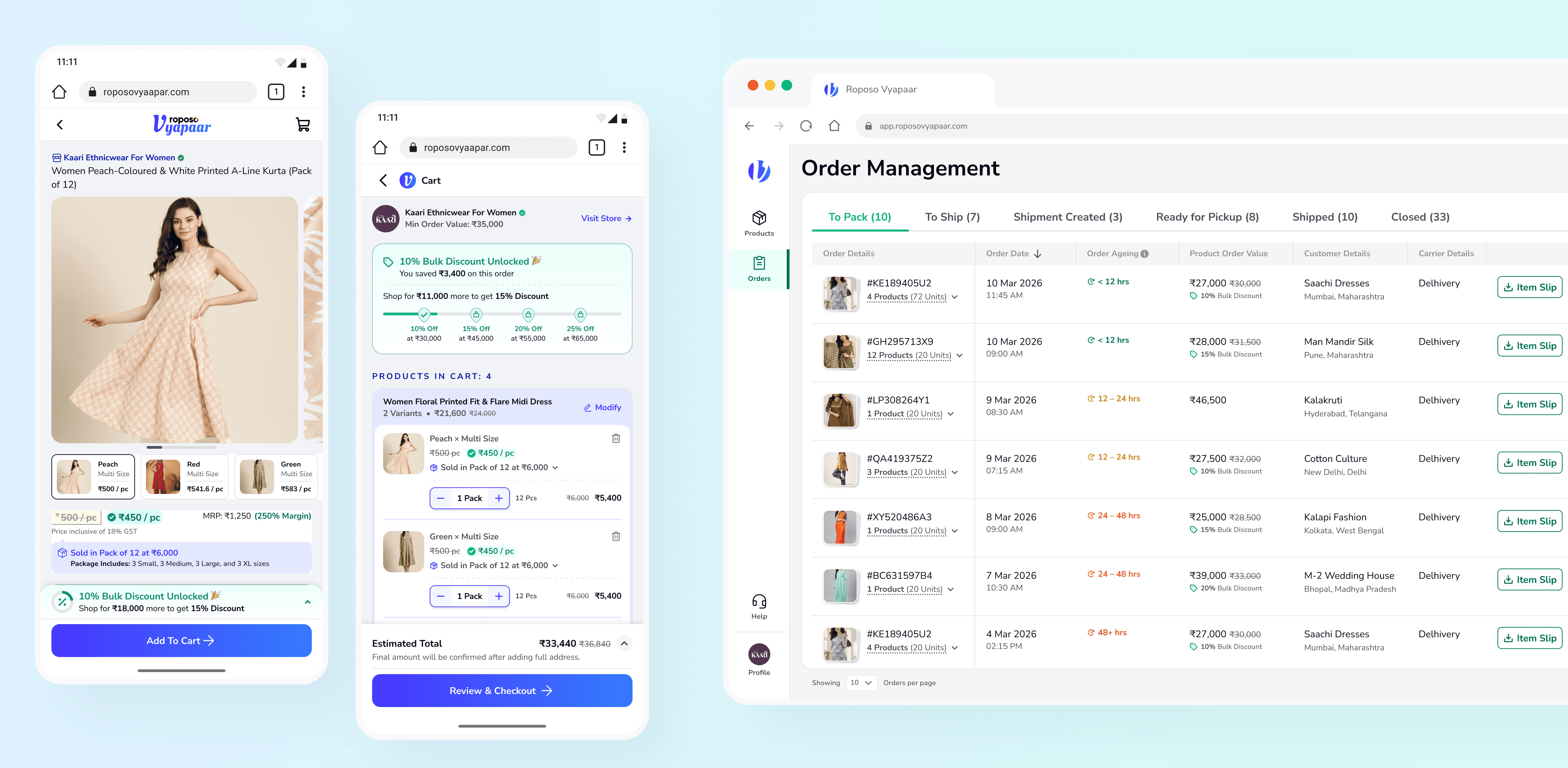
Small retailers were expected to place wholesale orders worth tens of thousands of rupees without ever meeting the supplier. I led the end-to-end design of a B2B marketplace where every design decision reduced uncertainty—from understanding price to receiving the correct order.
Role
Lead Product UX Designer
Timeline
4 months to design, 5 to ship
Platforms
Buyer (mobile web), Seller (web app)
Team
Fawaz & me (design), with PM, engineering, business, ops
[ The Real Problem ]
Wholesale buying demanded too many mental leaps.
Every purchase required buyers to answer three questions before they could commit.
- Can I trust this supplier?
- What am I actually paying?
- Will I receive the correct order?
[ Strategy ]
I mapped the uncertainty before the screens
Rather than designing every feature, I mapped the uncertainties that stopped wholesale purchases. Those became the framework behind every decision that followed.
[ Buying Experience ]
Removing uncertainty, one decision at a time
Every buying decision introduced uncertainty—understanding the price, trusting the final payable, and knowing when verification belonged. These decisions reduced that uncertainty step by step.
[ 01 ] [ Price Clarity ]
Make wholesale pricing understandable.
Suppliers sold in packs. Buyers compared products per piece. Every purchase required mental conversion before it could become a buying decision. The interface made those relationships immediately understandable.
Compare confidently
per-piece, not per-pack
Understand commitment
pack quantity
See real savings
discount slab

[ 02 ] [ Purchase Confidence ]
Never show a price we can’t commit to
Rather than promising a price we couldn’t guarantee, we separated estimated and committed pricing. Buyers first see an estimate, with the final payable calculated only after the delivery address is confirmed.
Show an estimate before delivery is known
Commit only after the address is confirmed

[ 03 ] [ Trust Building ]
Gate the action, not the exploration.
KYC was mandatory. The real design decision wasn’t whether to verify buyers, but when to ask. I explored three approaches before placing verification on the action that required trust—not on the browsing that built it.
Three approaches considered
Hide prices behind KYC
Too much friction before buyers could evaluate the marketplace.
Ask for KYC at checkout
The gate appears at the moment of highest purchase intent.
Nudge early, require before ordering
Explore freely. Verify only when the action requires trust.
Buyer Experience
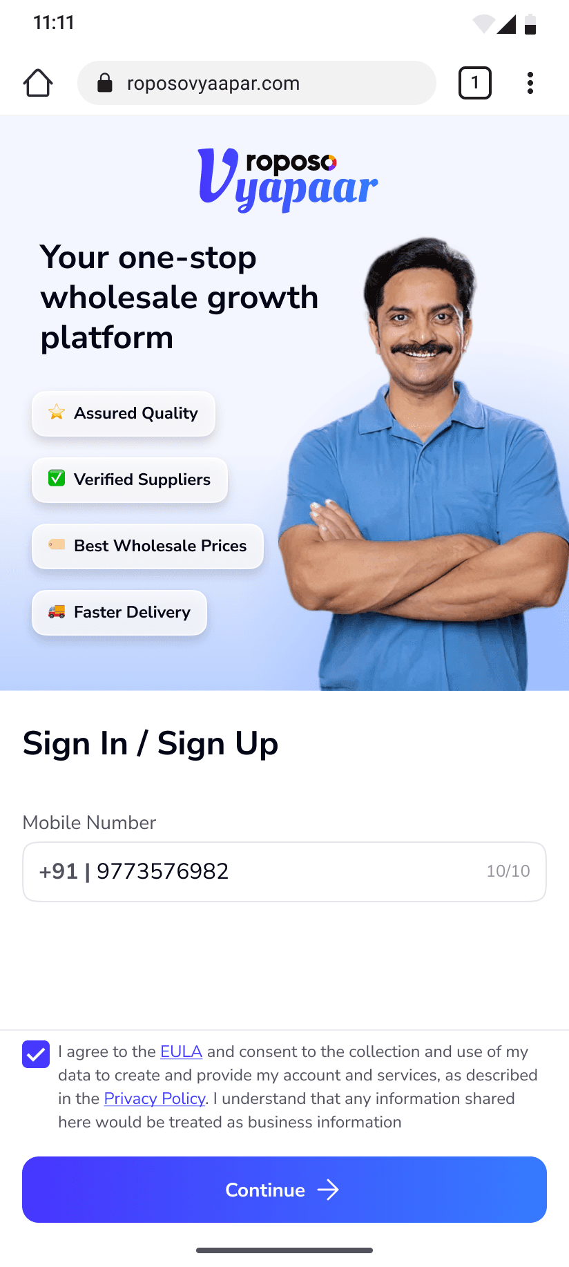
Beyond the decisions above, We designed the complete buying journey—from discovery to order tracking.


[ Marketplace ]
Every buyer promise depended on the seller experience.
Pricing, commitment and trust weren’t created on the buyer app alone. Every promise only held if sellers could fulfil it reliably.
That’s why I designed both sides of the marketplace together.

[ Operations ]
The promise only holds if the seller side does
[ 01 ] [ Platform Architecture ]
Not every catalogue change carries the same business risk.
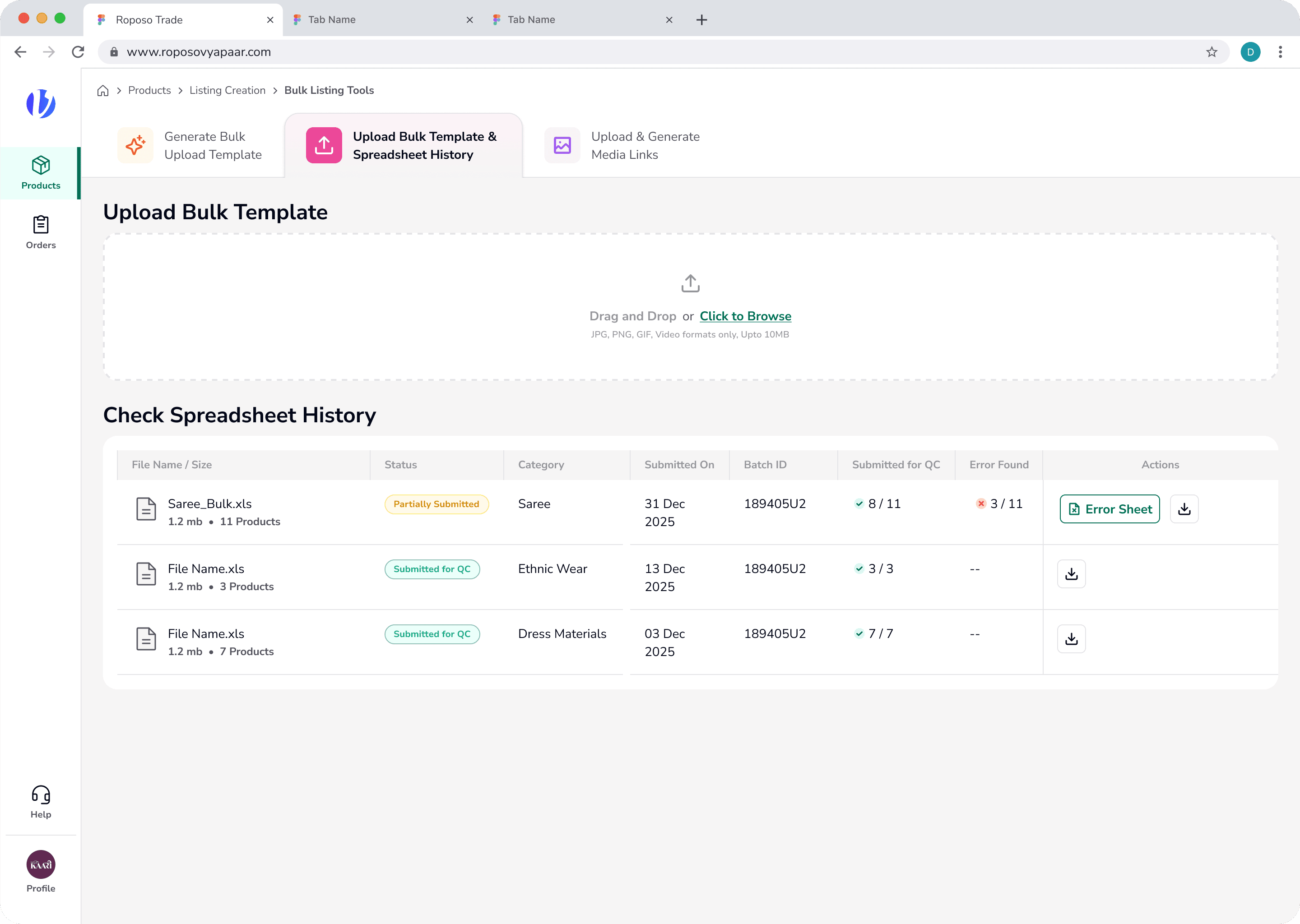
Price and inventory go live instantly, while product content passes through validation and quality checks before reaching buyers.

[ 02 ] [ Behaviour Change ]
Reduce cancellation by changing the mental model
Instead of asking sellers whether they wanted to accept an order, we assumed commitment and designed the workflow around fulfilment.

[ 03 ] [ Operations ]
Designed for the person packing the box
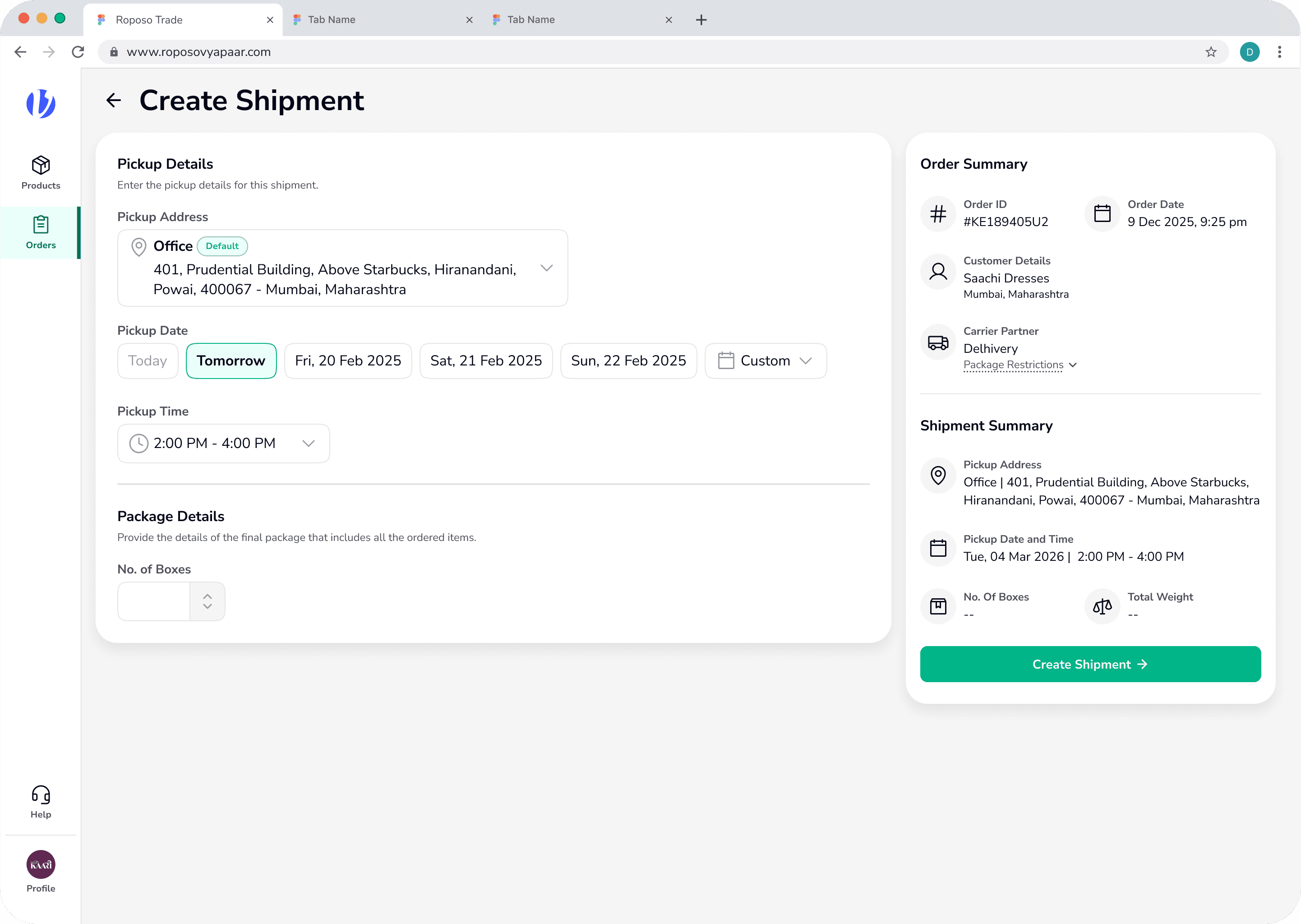
Operators worked from the system, but packers worked on the warehouse floor. I proposed a printable packing slip that helped them pick the right items and pack within carrier size limits.
Validated with suppliers and shipped as part of the final workflow.
Item-wise picking reduces missing products and quantity errors.
Box dimensions are recorded during packing, helps sellers pack within carrier limits, reducing repacking and delivery disputes.

Seller Operations
The seller platform covered the full fulfilment workflow, from catalogue management to shipment completion.





[ Systems Thinking ]
Build the foundation before the product.
Instead of perfecting branding, I established a minimal shared design system so design and engineering could start immediately.
Foundation before branding.
Engineering started building while the visual identity evolved.
One system. Two identities.
Shared components. Independent colour systems.
[ Design Leadership ]
Scaling the product meant scaling the design practice.
Four months, two designers, two connected apps. Leading here was less about screens and more about what let a small team move fast without losing quality.
I aligned Product, Engineering and Design around the marketplace strategy, ensuring both buyer and seller experiences evolved as one system.
Product Ownership
Owned UX strategy across buyer and seller platforms.
Roadmapping
Balanced launch priorities with long-term scalability.
Design Reviews
Introduced structured critiques to improve decision quality.
Engineering
Worked closely with engineering to simplify implementation.
[ Reflection ]