Making online wholesale clear enough to trust
A B2B wholesale marketplace where placing a first order had to feel safe — for buyers unsure of a new platform, and sellers running real operations behind it.
Small retailers had always bought wholesale in person. Vyapaar set out to move that online — connecting them directly with manufacturers, with fulfilment run end to end. I led end-to-end UX for both platforms, 0-to-1.
Role: Lead UX Designer
Platforms: Buyer (mobile web) · Seller (web app)
Timeline: 4 months to design the MVP · 5 to ship
Team: Fawaz and me (design) · with PM, engineering, business, ops


[ CONTEXT ]
The edge was getting it there
Vyapaar started as a business question, not a design one. Our dropshipping business was hitting its ceiling — RTO costs climbing, and resellers increasingly ordering straight from the listed wholesalers to skip our commission. That last part was the real signal: the wholesale demand already existed, it was just routing around us. So the move was to build the marketplace for it — small retailers buying directly from manufacturers.
But the category wasn't new — IndiaMART and Udaan had connected buyers and sellers for years. So the first thing I asked the PM was: what's our USP? The answer shaped everything. We'd win on fulfilment — existing courier tie-ups, competitive rates, and end-to-end logistics run by us. Not out-catalogue IndiaMART; just actually get the goods there, for less.
That answer became a design principle: if logistics and price are the promise, the product has to make both impossible to miss. It's the reason several decisions later in this study went the way they did.
[ THE APPROACH ]
Talk to the people who actually do this
Before any wireframes, I spent time with the people who'd live inside this product — retailers, manufacturers, sellers, and warehouse operators — to understand how wholesale actually works: how they price, how they decide, how an order physically moves from a shelf to a courier. Most of the sharpest decisions here came out of those conversations, not a design tool.
Foundation first. Before designing screens, I set up a minimal shared design system — a rough logo, a locked palette, core tokens and components. Engineering and product were waiting on design to start, and I wasn't going to burn weeks perfecting a brand while everyone stalled. Getting a usable system out early is what let two people move fast across two platforms.
Designing two platforms that depend on each other. The buyer and seller sides weren't two projects — they were one system, where each side produced what the other consumed. So I couldn't build them in parallel; I sequenced by dependency, designing the thing that creates the information before the thing that displays it, then looping back as each side exposed what the other still needed.
A catalogue, a price, a verification badge is set once on the seller side and read on the buyer side, so we kept moving between the two files, designing both against the same models. Get the model right and a mismatch surfaces in the file, long before it could reach a buyer.
[ THE STRATEGIC CALLS ]
Scope was the whole game
The launch plan set the scope. We'd seed the marketplace with suppliers already inside our dropshipping business — set up their stores, let them share store links with their existing buyers over WhatsApp, and run the logistics ourselves. A small, controlled launch, designed to scale. That let me cut hard without hurting the core:
Single-supplier cart, not multi-seller. Minimum order value is set per supplier and can't be combined across sellers, so for MVP a cart held one supplier's products at a time. Multi-seller cart was sequenced for later.
Bulk cataloging, not individual. Sellers arrived with existing catalogues, so I designed bulk listing and dropped one-by-one for MVP.
No separate logistics step. With one or two partners at launch, a whole checkout step for choosing one wasn't worth it — I folded it into a widget on the cart.
Delivery priced as one number. Insurance sits inside a single delivery cost rather than a separate line a first-time buyer has to decode and opt into — one clear number to trust at checkout, not a stack of charges to second-guess.
Some things couldn't be cut, because other things depended on them — tiered pricing needed seller configuration, verification badges needed the seller-verification flow, order tracking needed fulfilment updates. I mapped those dependencies so every buyer-facing promise had a working seller flow behind it.
[ THE BUYER ]
Earn trust before asking for anything
We'd seed the marketplace with suppliers' existing customers, but I designed the buyer experience for the wider base we planned to grow into — retailers new to the platform, price-sensitive, often buying wholesale online for the first time. Three decisions shaped whether they'd stay long enough to place a first order.
1. Gate the order, not the exploration
KYC wasn't optional. The business needed genuine, verified buyers, so compliance made verification mandatory. The design question was when to ask, and I worked through three options.
Lock the price behind KYC. The first proposal was to land buyers on the page but hide prices until they verified. I'd watched this exact pattern fail while auditing Udaan: in a price-sensitive market, hiding the price loses buyers before they've explored — and as a new entrant competing on price, gating price argued against our own pitch.
Ask for KYC at checkout. Closer — show prices, verify only when someone orders. But that puts the gate at the worst moment: once a buyer has decided to order, stopping them for verification is exactly when they drop off.
Nudge during onboarding, with a Skip, and lock the ordering. The one I chose. Explore freely, see every price, skip verification if you're only looking — but to place an order, you complete KYC. The gate sits on the action that needs trust, not on the browsing that builds it.
And because many of our buyers are small or online-only retailers without a GST number, I designed two verification paths — instant through the GST API, or a document upload verified manually by operations, with consent captured for compliance. Two doors, no legitimate buyer shut out.

Explore, but pricing stays locked
Explore freely, KYC only at checkout
Nudge during onboarding, with a skip
and lock ordering w/o KYC
2. Legibility over minimalism
Most of the buyer-side thinking went here, so it's worth showing the reasoning.
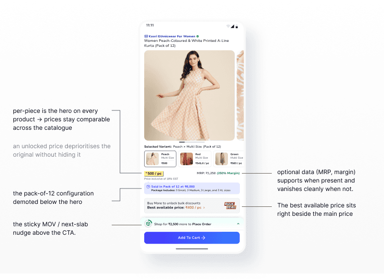
A wholesale product page carries a lot of price at once: a per-piece rate, an MRP and margin the reseller uses to price their own sales, a pack configuration, tiered slab discounts, and a minimum order value. All of it feeds the decision; none of it can be dumped on the screen flat. Cutting information wasn't an option — ranking it was.
Per-piece is the hero, always. Retailers reason in the price of a single piece and work out their margin per piece, so that's the number I made biggest and kept constant. The harder call was what to do when something sells only in packs — a pack of 12 at ₹6,000. The pack total could have been the headline; I demoted it and kept per-piece as the hero, for a reason bigger than "buyers think per-piece": if the hero flips between per-piece on one product and per-pack on another, a buyer can't compare two similar products at a glance. One consistent unit across the catalogue beat the tidiest headline on any single product.
Everything else ranks around it. The best available price sits right beside the main price, in the same per-piece unit, so a buyer scanning the number catches the deal in the same look. MRP and margin — reseller-facing math, shown only when the seller provides them — sit alongside as support. The pack breakdown, GST, and the full slab table stay present but quiet.
Unlocking a discount shouldn't move the goalposts. When a buyer crosses a slab, the new per-piece price appears right where they're already looking, with the original deprioritised beside it — struck through, not erased. They see what they'll pay and what they saved in one glance, without losing the anchor.
The upsell lives where the decision happens. The two things that grow an order — clearing the minimum order value and reaching the next slab — sit in a sticky bar just above Add to Cart, so the nudge to add a little more is always one glance away, never lost up the page.
The payoff: a buyer never has to relearn how to read a price, however the seller configured it.

3. No surprises at checkout
The cart is where a wholesale order gets real — several products, multiple variants, packs, discounts, a minimum order value, and logistics all landing at once. The rule here was simple: never show a number we can't stand behind.
Estimated, until we can be exact. Logistics cost depends on where the order ships, and from onboarding we only had the buyer's PIN code — enough to estimate, not to commit. So with a PIN alone, the cart shows an Estimated Total and says plainly that the final amount is confirmed once a full address is added. Only with the full address — exact location, exact logistics — does it show a Net Payable, all-inclusive. Printing a confident "final" price and then moving it at payment is the surprise I was designing against; an estimate labelled as an estimate is the more honest number.
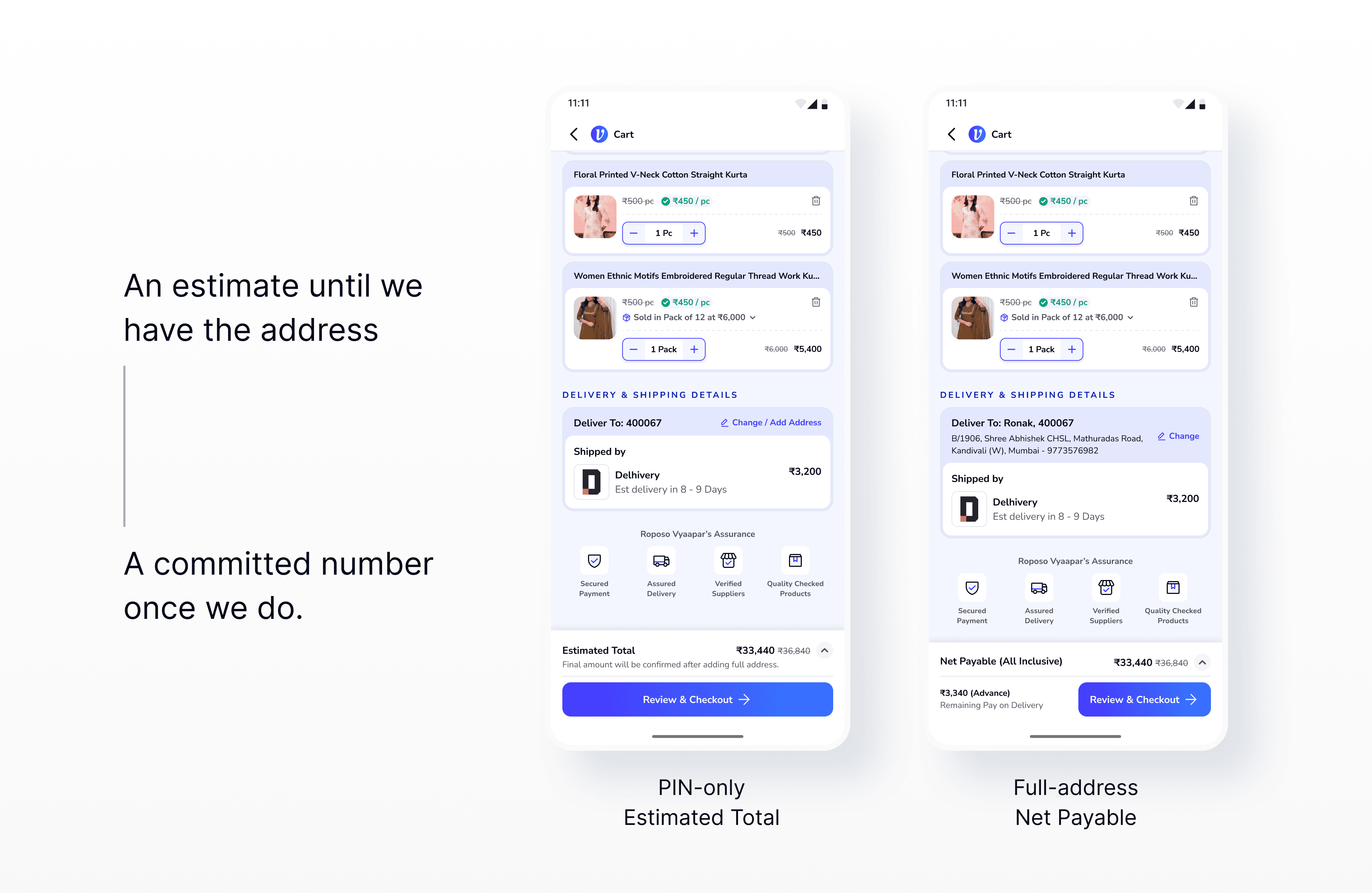
That's what makes the review step matter. If we only have a PIN, tapping Review & Checkout first routes the buyer to add a full address, then returns them to the cart — where the Estimated Total has become a Net Payable they can trust. Adding an address can even change the PIN, and with it the logistics, so catching that here, before payment, is the whole point. Review isn't a formality: on a large, multi-line wholesale order it's the moment the buyer confirms a now-committed number against what they actually chose — quantities, variants, packs — before any money moves. That's what earns it a step of its own.
The rest stays consistent. Discounts read exactly as they do on the product page — per-piece, original struck through, effective price beside it — so the buyer never switches mental models mid-flow. And the cart runs one nudge at a time: until a supplier's minimum order value is cleared, checkout stays locked and the only prompt is to reach it — no discount upsell yet, because pushing a bulk deal before someone can even check out is rushing them. Clear the minimum and the same slot flips: checkout unlocks, and the nudge becomes the next discount slab.

[ THE SELLER ]
Quality is made on the supply side
A clean buyer experience can't survive bad seller data, so the seller side was built to get quality right at the source — from fast store setup for seeded suppliers, through how catalogues go live, to how orders get fulfilled.
1. Let price move fast, gate the rest
Sellers list in bulk or one product at a time, under a four-level taxonomy that keeps a growing catalogue findable. The real decision here was quality control: what needs a QC gate before it goes live, and what doesn't.
Gating everything would choke a seller who just needs to drop a price or restock; gating nothing would let bad listings reach buyers. So I split it by impact. New listings and content edits — titles, images, attributes — pass through QC before they go live. Price and inventory changes go live instantly, because they're operational, frequent, and low-risk to catalogue quality. The gate sits only where it protects the buyer.
Bulk uploads recover the same way: a failed sheet comes back with its errors highlighted to fix and re-upload, and a failed QC routes a listing back to modify — never to a dead end.

Then fulfilment. I sat with sellers and warehouse operators to watch how orders actually move, and two things reframed everything: sellers don't think in "confirm" or "cancel" — they think "can I pack this today?" — and the person using the system is almost never the person packing the box. Two decisions came out of that.
2. Assume the order, don't ask for it
My first flow used the standard OMS states — Pending Confirmation → Confirmed → Ready for Pickup → Shipped. It mapped cleanly to how everyone talks about orders. But walking it through with business and operations, a risk surfaced that changed my mind: an explicit Confirm / Cancel choice makes cancellation feel like a routine option. Sellers would lean on it, accountability would slip, and the failures would land on buyers. The principle underneath stuck with me — giving users control isn't always good design, when that control works against the outcome.
So I rebuilt it around action, not decision. The states read as a fulfilment sequence rather than a choice: the system assumes acceptance and asks "are you ready to pack it?", with cancellation dropped to a secondary action. That one reframe pushed the mental model toward getting the order out, not opting out.



3. Design for the person packing the box
The flow got orders moving, but talking to sellers pointed at a problem that lived off-screen: packing itself. Wrong items and wrong quantities are a common failure in how these suppliers already work — because nothing bridges the operator, who reads the system, and the packer, who works the floor. So I proposed a physical-first packing slip inside the "To Pack" stage — a document the packer holds, not an app screen, carrying only what he needs in hand while the box is packed.
The PM's position was that it wasn't needed — operators and packers sit close together. I disagreed: Vyapaar's suppliers juggle several marketplaces at once, so mix-ups mid-pack are likely. Rather than argue, I prototyped it and showed sellers. They recognised it instantly. It went into the build.


[ THE DESIGN SYSTEM ]
One system, two skins
I built the shared system before touching screens, to keep the team moving. What made it hold up was how little the two apps diverged.
The system was deliberately single-source. Type, spacing, components, states — all shared across both apps. The one intentional divergence was colour: a blue system for the buyer app, teal-green for the seller. Same bones, two identities — so each side felt like its own product without becoming a second design system to maintain.
That economy was also a speed strategy. A decision made once was reused everywhere, so the junior designer could ship screens without me reviewing each one, and structured critique replaced constant oversight with a shared quality bar.


[ THE LEADERSHIP ]
Two designers, two platforms
The team was small — one junior designer and me — and hands-on for both of us. With four months to cover two platforms, how we split the work mattered more than any process.
We divided it by ambiguity rather than volume. The flows where an early wrong call would ripple across both sides — pricing, verification, the OMS, the buyer–seller mapping — I kept close. Anything with a settled pattern, the junior could pick up and extend across flows without waiting on me, and once the design system and critique rituals were in place, most of that work didn't need my review at all.
That gave the junior room to grow. They went from executing defined designs to owning full flows and defending them in critique — which was also where handoff quality to engineering got noticeably better.
The rest of it was protecting the work under the deadline. In trade-off sessions with PMs, we kept coming back to one question — what does the marketplace actually need to function credibly at launch? — so scope got cut deliberately, not at the cost of the parts that mattered.
[ THE OUTCOME ]
What shipped, and what I'd measure
Vyapaar was designed and prototyped but shelved before launch, so there are no adoption or revenue numbers — and I won't invent them. What there is: coherent buyer and seller journeys, a per-piece pricing system, two KYC paths, a commitment-forward OMS, a shared design system, and a prioritised MVP roadmap built to scale past the seeded launch.
And the direction wasn't untested. Prototype testing with real users validated the core bets: sellers found the commitment-forward flow more natural than Confirm/Cancel — they felt they were starting a task, not making a decision. Warehouse operators recognised the Packaging Slip immediately as something they'd actually use. Users new to OMS could articulate the difference between Shipment Created and Ready for Pickup by their second or third exposure to the modal.
What I'd measure after launch — buyer: detail-to-cart, bulk-order completion, slab usage. Seller: KYC completion, onboarding time, cancellation rate, packing errors, pickup success. Marketplace: active buyers and sellers, order value, repeat transactions.
[ REFLECTION ]
What shipped, and what I'd measure
What I took from it
Complexity should be organised, not hidden. Wholesale pricing was genuinely complicated. The answer was never to bury it — it was to rank it around how a retailer actually decides.
A two-sided product is one system. A buyer promise is only as reliable as the seller workflow behind it. Designing both sides, and moving constantly between them, surfaced the dependencies early enough to matter.
And the shift that stayed with me came from the OMS: I stopped asking "what should this screen show?" and started asking "what does this person need to do next, and what stands in their way?" The Packaging Slip didn't come from a wireframe — it came from watching a packer work and realising the system had forgotten about him. That's the job a design leader is really doing here: deciding which complexity matters, structuring it, and making confident calls around it under a real deadline.