Making online wholesale clear enough to trust
A B2B wholesale marketplace where small retailers buy directly from manufacturers.
Small retailers used to buy wholesale in person. Vyapaar moved this online. I led the design for both the buyer and seller apps, from zero to an MVP.
Role: Lead UX Designer
Platforms: Buyer (mobile web) · Seller (web app)
Timeline: 4 months to design the MVP · 5 to ship
Team: Fawaz and me (design) · with PM, engineering, business, ops


[ CONTEXT ]
Why we built it
We already ran a dropshipping business, but it was slowing down. RTO costs were rising, and many resellers had started buying straight from the wholesalers to avoid our commission. The demand for wholesale was clearly there — it was just going around us.
The market wasn't new. IndiaMART and Udaan already connected buyers and sellers. So I asked the PM what would make us different. The answer was fulfilment: we had our own logistics, better rates, and could handle delivery end to end.
That set the direction: make price and delivery the clearest things on the platform.

[ THE APPROACH ]
Understand the work, then build in order
Before designing, I spoke to retailers, sellers, and warehouse staff to understand how wholesale actually works — how they price, how they decide, and how an order moves from a shelf to a courier.
The buyer and seller sides were one connected system: each side created data the other one used. So I designed in order of dependency — build the part that creates the data first, then the part that shows it.
[ THE STRATEGIC CALLS ]
What we built, and what we left out
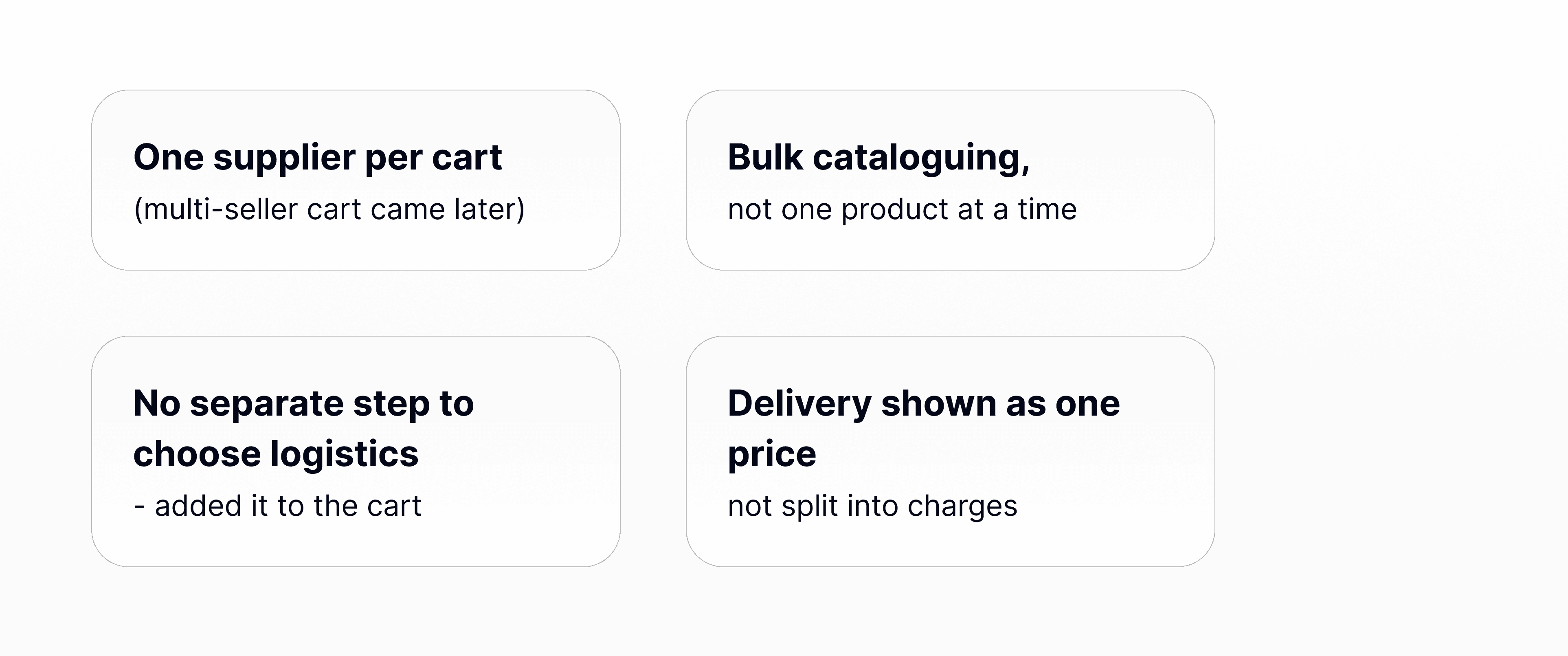
We launched small — starting with existing suppliers and their buyers — but designed it to scale. That let me cut scope without hurting the core:
[ THE BUYER ]
Build trust first
Most buyers would be new to the platform, price-sensitive, and buying wholesale online for the first time. Three decisions shaped whether they'd stay.
1. Gate the order, not the exploration
KYC was required, but the question was when to ask. I let buyers browse and see all prices freely, and only asked for KYC when they placed an order. There are two ways to verify — instant through GST, or by uploading a document — so no genuine buyer is turned away.

Explore, but pricing stays locked
Explore freely, KYC only at checkout
Nudge at onboarding, skippable
- lock the order, not browsing.
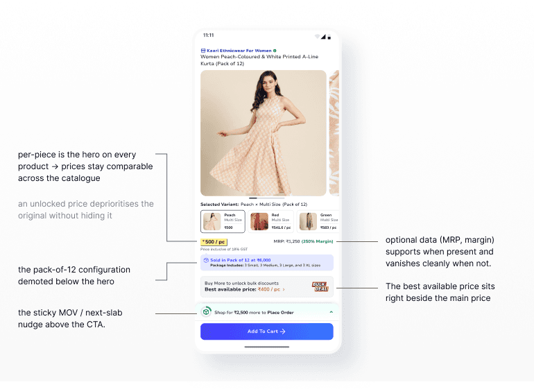
2. Show the price clearly
A wholesale price has a lot going on — per-piece rate, MRP, margin, pack size, bulk discounts, minimum order value. I built the page around one rule: the per-piece price is always the main number. That keeps prices easy to compare across products, no matter how a seller sets them up. When a discount applies, the lower price shows next to the original, not in place of it

3. No surprises at checkout
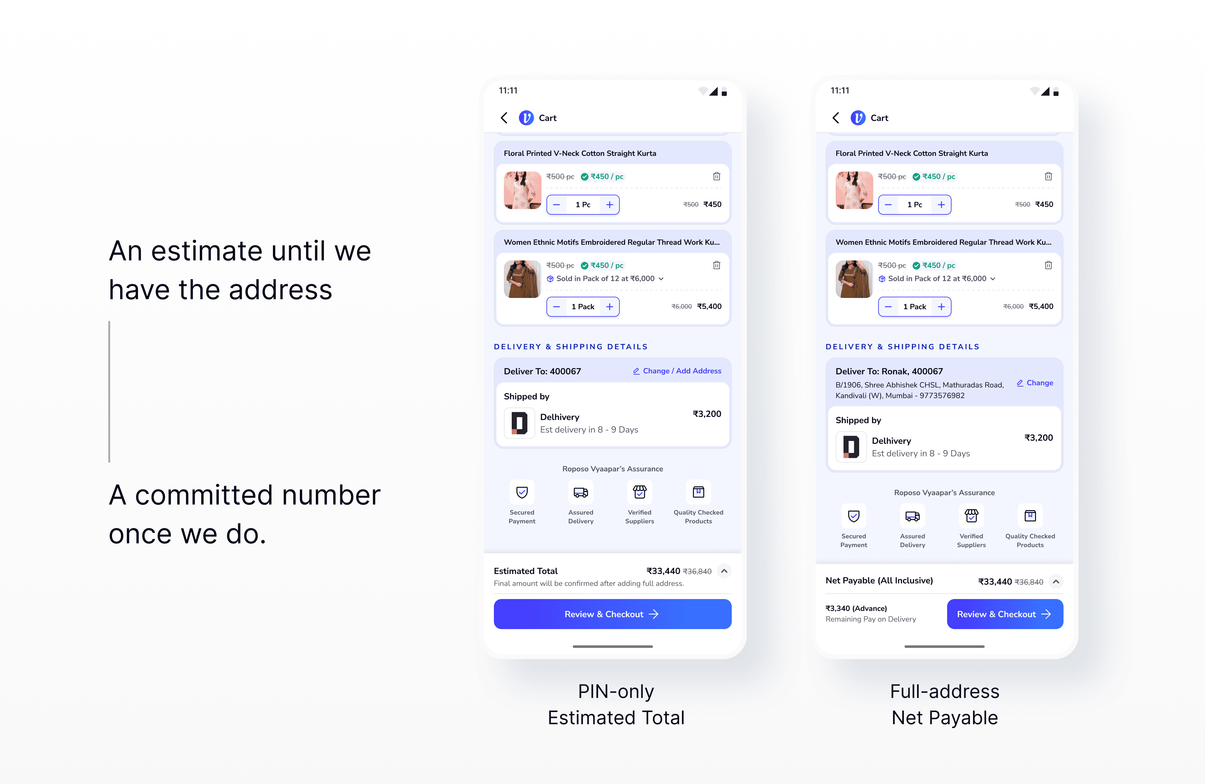
Never show a price we can't commit to. With only a PIN code, the cart shows an Estimated Total. Once the buyer adds a full address, it shows the final Net Payable. This is why the review step matters — it's where the estimate becomes a number they can trust. The cart also shows one nudge at a time: reach the minimum order value first, then the bulk discount.

[ THE SELLER ]
Quality starts on the seller side
A good buyer experience falls apart if the seller's data is wrong. So the seller side focused on getting things right at the source.
1. Let price move fast, gate the rest
Not every change needs review. New listings and content edits go through QC. Price and stock changes go live right away, since they're frequent and low-risk. QC only sits where it protects the buyer.

Then fulfilment. I sat with sellers and warehouse operators to watch how orders actually move, and two things reframed everything: sellers don't think in "confirm" or "cancel" — they think "can I pack this today?" — and the person using the system is almost never the person packing the box. Two decisions came out of that.
2. Assume the order, don't ask to confirm it
Sellers don't think "confirm" or "cancel" — they think "can I pack this today?" A confirm/cancel setup would make cancelling feel normal, so I built the flow around action instead. The system assumes the order is accepted and moves it toward packing and shipping.



3. Design for the person packing the order
The person using the system usually isn't the one packing the box. So I designed a printable packing slip — a document the packer holds, not another screen. The PM didn't think it was needed, but I built a prototype and showed it to sellers. They understood it right away.


[ HOW IT GOT BUILT ]
One system, a small team
I built one shared design system with two colour themes — blue for buyers, teal for sellers — so two designers could move fast across both apps. I took the harder, connected flows (pricing, KYC, order management); my junior handled the settled patterns and grew into owning full flows. When we planned with PMs, we cut scope on purpose, not by accident.


[ THE OUTCOME ]
Shelved before launch — but tested
Vyapaar was designed and prototyped, then shelved before launch. There are no launch numbers, and I won't make any up. But the main ideas held up in testing: sellers found the new order flow more natural than confirm/cancel, and warehouse staff recognised the packing slip right away.
What I took from it: a two-sided product is really one system. A buyer promise only works if the seller side supports it. And the best decisions came from watching how people actually work.